/f/92524/1423x870/434282d87f/1.webp)
A Fundamental UI Element
Adjusting the brightness of your smartphone screen. Navigating a YouTube video. Even looking for plane tickets involves sliders. They are indeed an integral part of our interactions with digital content. Software companies like Microsoft and Apple have published design guidelines including best practices for working with sliders. There is even a whole reddit volume control parody, an imaginary torture museum of horrendous alternatives to good old sliders. If anything, it is a sweeping reminder of how difficult it would be to build interfaces without them.
The First Sliders
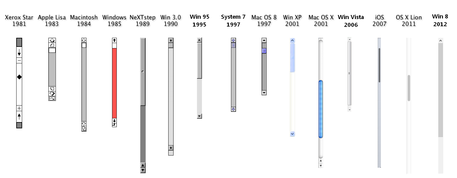
Today, sliders are so ubiquitous that one could almost forget they had to be invented. The oldest piece of design resembling sliders, both visually and conceptually, could be the first counting boards from ancient Babylone. They would evolve through the ages to what we came to call abacus.

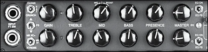
An abacus has a different purpose of course, but the main elements are here. Beads on a stick, forecasting thumbs on a track. Much more recently, volume and other range controls from amplifiers and mixing consoles were obvious physical predecessors to the slider. In fact, one could imagine that those sound recording and production devices were the direct inspiration for the very first digital sliders. Another early incarnation of the UI slider is of course the scrollbar. Scrollbars were already present in the first commercial GUI, the Xerox Star.
Why Use Sliders?
Take a minute to think about volume controls. On a scale of 0 to 100, humans are not able to pick the most comfortable noise level by entering a specific number. Finding the perfect sound level involves a gut feeling and wouldn’t be possible without immediate noise feedback.
In the physical world, circular knobs can be well-suited for this task. Knobs are also an option in software user interfaces, but they are not nearly as comfortable as their physical counterparts. This leaves us with sliders as an obvious choice. It is not difficult to imagine that with any other type of control (text boxes, dropdowns, +/- buttons, etc…), finding the ideal value would be much more cumbersome.
The case of volume controls helps us identify the typical attributes of a slider-friendly parameter. It often has many values which cannot be easily discriminated and need to be adjusted by exploring options fast. In short, when a user cannot formulate precise needs but will instinctively know when they are matched, sliders are a beautiful option offering the fastest and most fun choice navigation tool.
More Than Practical
Fun and exploration are definitely aspects to consider when choosing sliders. Vitaly Friedman (UX expert and founder of Smashing Magazine) notes that beyond the practical benefits of using sliders, they are appreciated by users in general.
When your users notice a slider control, a remarkable number of people will navigate towards the slider to “try it out” — grabbing the thumb and sliding it across the track to see what happens. Apparently, interactive elements do matter. We would observe it over and over and over again, on various websites representing various industries.
Vitaly Friedman, Designing the perfect slider
This observation makes the case for using sliders outside of the criteria I mentioned, so long as they elevate the user experience.
When To Avoid Sliders?
There are many criteria that come into play, when deciding to use a slider or not. In most instances, the answer is not obvious and largely depends on the design and implementation of the interface to provide an optimal experience. However, there are a few situations where using a slider is not good practice.
- Need for precision: Think of a dimension parameter which can take any value between 200 cm and 400 cm, up to a millimetric precision. Sure, a slider lets users explore this range efficiently, but if they already know the value they need, sliding there is not as comfortable as directly entering, say, 216.4 cm in a text box. As a matter of fact, a slider might even be hurtful to the user experience. In this case, exploration is not key. Getting to the point is.
Pick a number between 0 and 10,000 and try to reach it with the slider...
- Delayed feedback: Some quantities might seem ideal cases for using sliders, but for one reason or another suffer from delayed feedback. This happens when chosen values trigger a computation that takes a few seconds before displaying results. Fetching large amounts of data might also cause such delays. Sliders are conceived for iterating fast between choices and getting immediate feedback.
Pick a number between 0 and 100 and try to reach it with the slider...
- No sense of progress : Whether it is explicit or not, there should be quantifiable effect from moving the slider: decrease to the left, increase to the right. It would be bad practice to have users pick from mismatched options (five different colors, for example) by grouping them in a slider.
Pick a color and try to reach it with the slider...
- Very few values : No one needs a slider to pick between a handful of options. Dropdown menus or checkboxes provide a better overview of the different choices and a more convenient way of picking the right one.
Pick a number between 0 and 2 and try to reach it with the slider...
Cross-Platform Considerations
Sliders became more difficult to handle since users stopped consuming software through mouse and keyboard only. Touch screens have proved tricky for smooth slider interactions. Precision is degraded, while the thumb and the track of the slider are often too small. Smart TVs also present unsolved UI problems when it comes to sliders. Browsing to the middle of a Netflix or Youtube video using a TV remote remains a frustrating experience to this day.
Indeed, while sliders are still one of the most effective UI tools, they need to be handled with care. It’s especially true in the context of product configurations.
Sliders In Product Configurators
Sliders are commonly used in product configurators. They are appreciated for being intuitive and fun, as should the configuration process be. In this section, I want to apply general considerations about sliders to the product configurator case and see if it can lead to concrete design solutions.
Sliders Applied To Choice Navigation
In the previous section, I mentioned four discriminating criteria for choosing or rejecting sliders. Let's see how they apply to the different types of parameters commonly found in product configurators.
Functional parameters are the options controlling mechanical and other physical properties of a product. Dimensions are a typical example of functional parameters, as well as technical specifications (the amount of storage in a smartphone) and in some cases materials. Functional parameters usually need to be defined precisely by the user, a property which makes sliders less than ideal. On the other hand, they usually have clearly defined numerical values and provide an explicit sense of progress.
Aesthetical parameters control the more subjective options of a product. The color of a lamp or the shape of a diamond are chosen according to consumer tastes, not constraints to be matched. In a configurator, the personalization experience comes first and foremost from controlling aesthetical parameters. These parameters usually offer fewer possible values and no sense of progress, which goes against slider best practices. On the other hand, they are precisely the expression of a gut feeling, and they don't come with a need for precision.
In both the functional and aesthetical cases, going with a slider will largely depend on the quality of the feedback. When interactive visual feedback and fast price updates can be achieved, sliders are an opportunity to create a great user experience. This has been implemented by Munson Furniture to beautiful results.

Configurator-Specific Challenges
Additionally, product configurators bring with them two additional challenges to consider when using sliders:
- Multiple parameters: Too much choice leads to the freezing of customer choices, and even to anxiety. Leaving freedom to the customer, while appealing to some extent, should also be controlled. One should not hesitate to combine parameters with similar effects into single controls (such as sliders). Restricting the parameter space might sound counter-intuitive, but it allows customers to focus. Additionally, when they are done well, parameter aggregations can lead to more obvious visual feedback, as well as better-defined price variations.
- Product logic: All these parameters are rarely independent from each other. Such car option might only be available in blue. Such wardrobe will have limited size options when choosing pine wood instead of oak. If the available options for a specific parameter are dynamic, a slider might be a confusing UI option. The range might change during the configuration process, sometimes even specific values will become unavailable. With a dropdown, one can easily disable options by greying them out. Sliders don't have that type of flexibility.
Sliders For Parametric Products
With the help of parametric design, platforms like ShapeDiver make it possible to create product configurators for extremely flexible and complex products of all kinds. Parametric design allows a large range of shape parameters, which combine the ideal properties for slider interactions. They give a sense of continuous progress along large ranges of numerical values, while being purely aesthetical in nature and visually impactful. As a consequence, parametric products tend to be more slider-friendly than others.
On the other hand, the flexibility of parametric design opens a world of exciting possibilities. However, it comes at a cost that needs to be properly managed. Parametric designers know too well that the number of sliders of their models often get out of control. Furthermore, complexity comes with heavy computation costs which tend to delay the visual and logical feedback from the user choices. A special focus is needed, in order to optimize parametric models for their integration within user interfaces.
Beyond Sliders
It has become clear that choosing the right interface controls for product configurators can become an inextricable problem. When it comes to functional parameters especially, the ideal solution could be to get rid of them altogether within the configurator. Can that be achieved by funneling customers through their preferences?
A well-conceived configurator will let users enter with predefined options and even hide some of them, depending on what they are looking for. This way, a single configurator can be broken down into segments that each provide a more welcoming set of options. H+H Systems, for example, implemented this strategy with a lot of success.

For consumer products, the inbound approach can be optimized further by leveraging the zero moment of truth. With the appropriate SEO strategy, along with online advertisement systems, it becomes possible to understand the customers' needs even before they reach your website. While it might not be widespread among online shoppers yet, an online search for table 60cm x 120cm already produces many matching results. Why not make it an entry point to a table configurator?
Thinking ahead, it is easy to imagine a future where configurators don’t need user interfaces anymore. In this scenario, the parameters are set by AI and machine learning algorithms. Consumers only end up seeing the products and variations that are truly subjective. The ones that AI will have trouble guessing for a little longer...
In A Nutshell
For the time being, selling complex products online is not realistic without the use of a product configurator. However the configuration process does not need to be painful. With the right concept, it can even become a powerful marketing tool.
Make it as fun or as short as possible. At least, come up with a good balance of those two. Sliders are fun, if they are in limited quantity and provide satisfying visual feedback.
Avoid using sliders for functional parameters whenever possible. When consumers explore options, they should be able to focus on what really matter to them. Build the choice navigation around true personalization.The users should feel like their choices have a real impact on the end product. When such a level of co-designing is reached, you might find that your configurator comes to embody the very essence of your product.
And you can bet users will notice too.
Are you or your company looking for a solution to build fantastic online product configurators? Reach out to us at contact@shapediver.com and let us know about your project! We'll be more than happy to help you figure out if ShapeDiver is for you.
